How to make friends and win over people in the Digital Age

The world wide web, the internet or the big blue, no matter what you choose to call it; the ‘www’ can be a tricky place to navigate. If you are not careful, you maybe land-up in a dark alleyway and before you know it you are mingling with the wrong crowd. The situation can be tricky to get out of. So, as a product, how do you make sure that you are reaching the right (read relevant) people and not ending-up being “that annoying product I keep seeing on all my news feeds?”. The key is to understand who is it that you are speaking to. This is where Digital Marketing Analytics comes into play. Not to be confused with Web Analytics, Google Analytics is a tool that measures the effectiveness of your marketing campaigns across different platforms at each stage i.e. from acquisition to closing. As is evident, there are two ways in which you can get an insight into the minds of your consumers:

  1. Web Analytics: This type of data gives information about criteria such as page load speed, pageviews per visit, and time on site etc.
  2. Google (Digital) Analytics: This type of data can give you more holistic and all-around information about the nature, habits, demographics, and many other behavioral aspects about the audience that visit your website.

It is imperative that we understand that, it is finally humans and not machines that are buying your product or visiting your website. Humans are made of more than just numbers. They are made of routines, surprises, habits, rituals, flesh, skin, blood, and bones.

social-media-cartoon.png

Once you can build-up the persona of your intended consumer in your mind, it becomes easier to tailor your communication to suit them. It is also important to note that we are all creatures of habit; if we have bought something at a certain time in our past, we are very likely to make the same purchase again during the same time. In the rapidly changing world of today, we often hide small stories behind huge numbers, data, and graphs. As social media marketers, it is our job to demystify these stories and help create newer ones for our audience. One of the simplest ways to understand the complex world of digital marketing is to draw everyday parallels and place them in a context that we can all understand.

Reading Google Analytics is very much like getting to know your favorite person:

Think about your best friend, think really hard. Won’t it be weird if you didn’t know what languages they can speak or which places they like to hang out at?

Well, Google Analytics works much the same way. Learning to make sense out of Google Analytics will slowly and surely bring you to a realization that you are gaining an insight into, what your end-audience looks like.
Targeting is like hanging out in the right circles:

Google AdWords, keywords and some other tools enable you to target your ads to a very specific audience, as does Facebook. You can not only select the demographics, but also the likes and dislikes of your audience based on their interests. For eg: If you are advertising for a musical concert and you are getting more leads from Viman Nagar (Pune), and you can independently verify that the majority population of the region is in the age group of 18-27; you can safely say that your end-audience is a student between the age group of 18-27 with music listening habits that are close to the artist you are advertising. Linking this data further with other social or real-time observations about their habits and mannerisms can help you build a character profile of your user. Once you know who it is that you are talking about, it becomes much easier to tailor your communication as the need may be. To illustrate this point further, let’s assume that you are the owner of a steel manufacturing unit, and you are getting more traffic out of the above-said region; it is safe to say that you perhaps need to re-orient your marketing efforts because this group is unlikely to make a purchase of a product like steel. The right targeting is thus like choosing your friends well – it helps you to be noticed in the right circles and ensures that you stay relevant.


Derive your strategies from personal experience:

post-10-01-Done.png

Think of it this way, before becoming a social media marketer, a digital enthusiast or a business-owner; you are a human being. That means you also use the internet and that means that you too are the target of some marketing campaign or the other. Now, ask yourself this question: When was the last time that you felt like making a purchase or take any action for that matter after you saw something on the internet? For me, this happened as I wanted to choose some makeup products to go with my wedding dress. I clicked on the link of a Facebook Ad that eventually led me to a cosmetics website. I bought a lip tint, a blusher, and an applicator sponge. Thereafter, I was continually receiving prompts from the same site about make-up products that would complete my D-Day Kit such as primer, an eyeliner, and a mascara. In this particular case, relevance and timing was key. What was it in your case?

Chances are that what prompted your action was one of the following factors:

A. You were being continually bombarded with the message without you being conspicuous or irritated by it.

  1. The content (written or audio-visual) caught your eye with its creativity or precision.
  2. You have made similar purchases before.


Keep the above principles in mind and you are GOLDEN! Thus, the Mantra is: Know who your core audience is, know what channels they frequently visit, and know what kind of messaging gets an action out of them. This is precisely the data that analytics can provide you with. Once you start thinking as a prospective customer, tailoring your content becomes easy.


Learn basic social skills:

“On the internet, as in real life – manners are important. Once you get to know people it is easy to understand and fathom how they like to be spoken to.” 

The same is true with your audience. To elucidate the point further, let’s assume that you are with a girl you like. Once you start meeting her often, you start getting to know what phrases she uses, what places she frequents, what are the kind of friends she hangs out with, and what place she belongs to. This is exactly how you get to know your audience. It is also important to note that this does not amount to stalking! All the information shared by Google is volunteered by the audience themselves.

soundest-email-marketing-9.jpg

However, it is also important that you do not approach them constantly and become an annoyance. Try to keep your interactions limited to the websites they visit frequently, using the information shared by the web browser i.e. Cookies. Approaching your audience after they have left the site is called re-targeting. If you manage to recapture their interest, they are more than likely to make a transaction. It is a useful tool, but remember that it works better as a part of a larger digital strategy rather than a sole endeavor.

a62b2ea5ef1ca1552c239bf2f30f0e72.jpg

“Strategies involving content marketing, AdWords, and targeted display are great for driving traffic, but they don’t help with conversion optimization. Conversely, retargeting can help increase conversions, but it can’t drive people to your site. Your best chance of success is using one or more tools to drive traffic and retargeting to get the most out of that traffic. (Source: https://retargeter.com/what-is-retargeting-and-how-does-it-work)”


Conclusion:


One of the best ways to make sense of digital marketing is to understand that you always need to put a face and build a profile of the person that you are talking to.


Once you have done that, you can go about building a personality too! It will take time and quite a few dead alleys to get to the right audience, but once you do the effort is definitely worth it. One of the greatest misconceptions about digital marketing is that – Through your messaging, you are talking to everybody. The golden rule of thumb is to keep it in your head that if you are talking to everyone, you are reaching no-one. On the other hand, when you are talking to one person alone and that person has the exact same attributes as you would want your ideal audience to have, your efforts are far more likely to yield results and ROI. And finally, simple manners and class truly go a long way. Keep these qualities constant in your messaging, and you are sure to hit the right note!

A glimpse into the HQ of the Social-Networking powerhouse- Facebook

Recently, I was at Oculus Connect 2017 in San Jose. During my stay, I got an opportunity to visit the Facebook Campus in Menlo Park, California. It was one most exciting experiences. The energy and open culture I experienced was highly infectious. The way Facebook has built a warm and engaging workplace for its employees is a great example of how an organisation can get the best out of its resources.

From an analog wall that allows an individual to calculate Facebook’s popular parameters of audience reach to the wood workshop where you can make your own wooden toys that promotes the idea of nurturing a hobby, everything is well-thought and fascinating. The ‘no cabins’ culture is something that’ll definitely be a trendsetter.

I’m happy to share some of my memorable moments from this trip.

Instagram’s new office looks like its App.  It has been designed by a Hollywood set designer. The three modular set is perfectly illuminated for mobile photography.


Impressive, 9-acre rooftop garden on Facebook Menlo Park, California HQ that overlooks the city’s marshlands.


IMG_2604Wood Studio to explore Hobbies on Facebook campus. 

The slogans placed around the campus give a revealing look at this atmosphere of change and innovation, “Fortune Favors the Bold”, “Move Fast, Break Things”, and “Hack Often”.

Facebook Analog wall that shows potential reach just as Facebook Adverts.


– Rugwed Deshpande  (Director of Setu Advertising)

Now playing, the anthem of kitchens across Maharashtra


It’s a well-known fact that since 1960, Suhana Ambari has been the leading spices brand in kitchens across Maharashtra. And in spite of its strong legacy and a well-established, extensive regional spread, the brand has never spoken about its leadership position and its impact on food and kitchens across Maharashtra.

Recently, the brand came out with its new packaging and an evolved identity. While the main motive was to communicate this change to its lakhs of customers, the communication had to live up to the brand’s personality and its thought leadership in this segment.

While the term brand campaign is a part of our everyday jargon, this opportunity seemed special. At Setu, we decided to transform this communication into a celebration of the brand and its presence across kitchens of Maharashtra. The message (crafted by us), ‘Gharoghari Ambari’ (Ambari in every home), saluted the brand’s popularity. A jingle and a TVC took this simple yet heartfelt message to homes across Maharashtra. While the thought process and execution gave us immense delight, what happened after the TVC hit the screens across Maharashtra, was what we hoped for – a celebration across Maharashtra.

This is what the custodians of the brand gave us as a feedback about this campaign –

We believe that the TVC, and more importantly the jingle, has been a milestone in the journey of Ambari. Usually, we look forward to sales numbers when our campaign hits the market. But this time around, we were pleasantly surprised. The jingle and more so the catch phrase (Gharoghari Ambari), has been a huge hit among people. In fact, going beyond the intended target audience, it has become extremely popular with our vendors, distributors and other people of the market, who are only obsessed with offers and numbers.”

“The TVC, and more importantly the jingle, has been a milestone in the journey of Ambari”.

As we tried to understand their perspective of what made the communication work so well, we got some interesting pointers.

“The warmth in the communication has been appreciated and has effectively delivered our message of being a part of Maharashtra’s every home. Without being boastful, it gives us and our loyal customer base, a chance to celebrate Ambari’s contribution to kitchens across Maharashtra. In today’s time, when people don’t think twice before giving a negative feedback in detail, but communicate appreciation through just likes, we felt happy when some of our customers from different cities of Maharashtra called us and praised the TVC. One memory that particularly stands out is when one of our customers called and told our representatives that the TVC feels like a complete family entertainer. We felt happy because this is exactly what Ambari spices have been doing for more than 60 years – entertaining the taste buds of people across Maharashtra”.

“Our customers called and told our representatives that the TVC feels like a complete family entertainer.”

In today’s age of analytics, there are instances when numbers alone don’t show the exact picture. The honest feedback that the brand received and the passionate manner in which they shared all the reactions with us, make us feel good about being part of a brand communication that has truly reached ‘Gharoghari’.

Crafting a reassuring brand promise in the era of RERA

Brand:
With the core objective of not just building homes, but memorable lifestyles, Rachana forayed into creating developments at the most prime locations in Pune, 30 years back. Since then, these residential and commercial complexes have stood the test of time to embellish the skyline of the city. Along with delivering what suits the customers’ needs best, Rachana Lifestyle as a brand stands strong on its sound financial background and deep-rooted values of transparency.

Challenge:
While RERA was introduced to empower the homebuyer, there was a sense of anxiety among the buyers. At this point, it was important for a sound brand like Rachana Lifestyle to communicate the fact that home buying with them was and will always be peaceful, calm, and a delightful process. Where simple things like peace of mind when buying a home is rare, Rachana promised to make the customer’s life and world better through the lifestyles they deliver. It was important for the brand communication to embody this message.

Strategy:
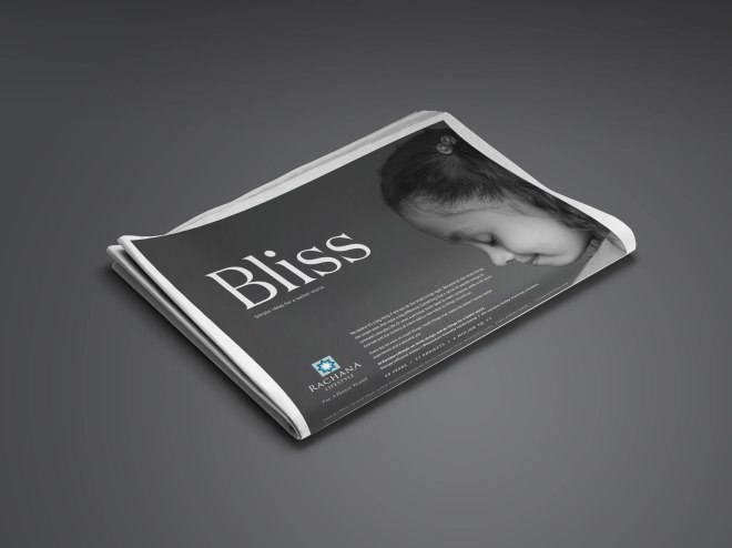
With an objective to cater to this challenge we devised a corporate campaign highlighting how Rachana strives to make the home-buyer’s world better. This thought was based on the idea that simple joys always make the larger difference. In a clutter where everyone was making larger promises, Rachana was making a difference by delivering simple things like peace of mind, calmness, and delight. All these factors played the key role in making the world a better place. Be it through their charitable endeavours or transparent dealings!

RACHANA DIGITAL-01

Execution:
We executed an extensive hoarding campaign across Pune. The thought of delivering a better world was highlighted through a clean layout and clear communication. By focusing on the three most important human aspects of calmness, peace, and delight, we created an unforgettable impression in the viewers’ minds. The serene yet expressive faces strategically placed and used as visuals, beautifully synced with our keywords. They added the right touch of warmth to make a better impact. Most of all, they reflected the philosophy of a ‘better world’ that Rachana Lifestyle works incessantly to deliver.

Results:
A brand campaign in real estate that spoke about the simple joys of life, was a refreshing change for the home buyers. This registered Rachana as an honest and believable brand in the hearts and minds of the people!  

Newspaper

Addressing the uncertainty of MOMs-to-be with care

Brand:
The ONP group of hospitals are leaders for medical care in Western Maharashtra. Along with being pioneers of IVF and mother & child care in Pune, ONP is known for its expertise across India and the world. The brand goes beyond medical care by providing cutting-edge treatments combined with the comfort of experienced doctors. With a specialisation in mother and child care, they have always felt responsible for catering to the challenges of maternity, addressing them with care.

Challenge:
Recent surveys in the maternity sector had made it very evident that most of the mothers are advised to go through a caesarean delivery. The escalating costs and uncertainty of a normal or a Caesarean delivery, put an emotional and financial burden on many families. Be it a normal delivery or a caesarean, eliminating the emotional and financial uncertainty associated with deliveries was the need of the hour! That’s where a brand like ONP offering quality care at a fixed cost came into picture.

Strategy:
With an objective to cater to this challenge we devised the Master of Maternity (MOM) program for ONP. The MOM program offered uncompromising care at a fixed price of Rs. 29,999/- only. This program was made available at the ONP Tulip Hospital (Gokhale Nagar) and the ONP Meera Hospital (Shankar Sheth Road) with dedicated number of beds for the MOM initiative. We created a logo for the MOM initiative to give it a distinguished identity and caring appeal. For the full benefits of MOM, we had pre-enrollments and registrations for the moms-to-be.

Hoarding Mocks

Execution:
With an agenda to make MOM reach the masses so as to fulfil ONP’s social duty towards women along with paediatric care, we created hoardings across Pune. The communication was clear and highlighted the benefits of enrolling for the MOM program. Along with outdoor media, we created excellent PR through a press release that established the objective of the initiative. A press kit was created to reach out in the best possible manner and make a mark. With good media coverage, we were able to create awareness amidst the masses through leading newspapers. This was accompanied by other print media in the form of letters, leaflets, and enrolment forms.

Results:
The MOM initiative and campaign generated a lot of buzz, and ONP received a good amount of registrations and enrolments for the same. Through this social endeavour, ONP was able to give their best care and support to women and their families.

Shaping the identity of Women Entrepreneurship in Real Estate

BRAND:
CREDAI Women’s Wing (CWW) is a vertical of CREDAI (Confederation of Real Estate Developers’ Association of India), and focusses on empowering women in this segment, which has been traditionally dominated by men. The CREDAI Women’s Wing aims to achieve this through training and engagement of women real estate developers, across India.

CHALLENGE:
Real Estate and CREDAI have garnered a reputation of being male-centric or dominated, over the years. The first and foremost challenge faced by CREDAI Women’s Wing was to create an identity that would highlight it as an organisation run by the women, for the women.

STRATEGY:
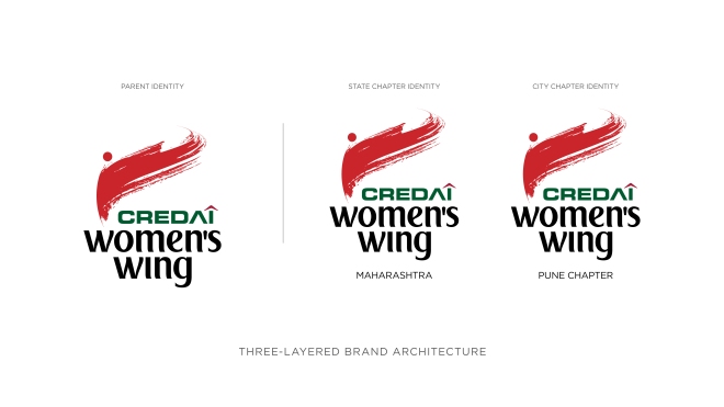
An identity with a strong symbol can be a highly effective tool for communicating a brand’s motive and can create a lasting impression. We decided to understand the core values that strongly represent the personality of the CREDAI Women’s Wing. Through our interactions, we narrowed down on 3 key drivers –  confidence, leadership, and trust.

IMG-20171031-WA0021

 IDEA:
In India, a red bindi (a circular accessory on a woman’s forehead), is the most popular traditional yet cultural symbol for a woman. We used this red bindi to establish the woman-centric approach of CREDAI Women’s Wing. We complemented it with a free stroke that symbolised positivity and naari shakti (woman power). The font used in the identity, further strengthened this confidence and leadership values.

Touchpoints 05-07

Touchpoints 05-08RESULTS:
The identity formed an instant connect with the members of the CREDAI Women’s Wing. As it perfectly captured the brand motive and philosophy, it gave a great stepping stone for this new brand to impose itself in the minds of its target audience, and establish a strong connect with them.

Personifying a golden legacy across generations

Brand:
A brand that is almost synonymous with being a Punekar – P.N. Gadgil is a name that stands for blind trust and purity in gold jewellery. A brand with a legacy of more than 185 years, PNG 1832 is led by Abhay Gadgil. While PNG 1832 takes forward all the core values of the pioneer brand, it also adds a contemporary twist to tradition. The location of the store – at Nal Stop – gave an edge to the brand and its promise.

Homepage Thumbnail-01

Challenge:
The brand PNG 1832 was to be unveiled to the people of Pune with its first store at Nal Stop. The primary challenge was to find that one crucial differentiator while staying true to the original legacy. The prosperous city of Pune is home to many jewellery brands that have a loyal customer base. Thus, the brand PNG 1832 had to be set apart from this clutter without alienating it from the pre-existing legacy of P.N. Gadgil Jewellers in Pune.

Strategy:
At Setu, we decided to package the longstanding legacy of the pioneer brand with an emotional hook. With the understanding that the brand has connected with families across generations, we came up with the concept of ‘Family Jewellers’. The core idea behind this thought was that the brand always took care of the customer’s interests honestly, above anything else.

The launch of the PNG 1832 store at Nal Stop was a grand success. The store was launched during the auspicious days of Navratri and thus, could align itself to the upcoming festive season in the most optimum way. The look and feel of the store set itself apart from the other jewellery outlets. However, the brand communication ensured that its legacy stayed intact.

02_Newspaper mockup


Results:
PNG 1832, while deriving its legacy from the pioneer brand, successfully carved a niche for itself in the hearts of Punekars. A fact that was evident from the astounding footfalls that it gathered during the festive season of Diwali as well as Dussehra.


Turning the clock back…

The smell of freshly mown grass, the fragrance that lingers in the musty back rows of a library, the dusty scent of a long forgotten suitcase, the taste of raw mango spiked with salt and chilli; know what they all have in common? They all trigger memories of a time we have long left behind. We long for it, almost wistfully! Nostalgia – The emotion we can all ascribe to, the one link to our past that we dare not let go and the thread that, when pulled at, unravels a thousand others.

I, for one, often fall hook, line, and sinker for any advertisement, song or even a visual that tugs at my heartstrings. Suddenly, I realise that in fact my memories have been stirred and I feel like I am being transported back to the time when I first acquainted with that particular stimulus. More often than not, the memories are of a simpler time, of easy laughters and shared dinners without the looming spectre of the internet. This ad in particular always reminds of a time when Dairy Milk was not only the greatest reward, but it was also the best way to celebrate a win! The way she just dances onto the cricket pitch with careless abandon is heartwarming!

CroppedImage530370-cadbury1

Due to this precise psychological impact, nostalgia is a concept that has been extensively explored in advertising. Along with the power of recall, what goes on in our mind is a process called selective retention which implies that, you more accurately remember messages that are closer to your interests, values and beliefs, than those that are in contrast. This helps in narrowing the flow of information so that you remember only what is important.

Brands use nostalgia to evoke particular feelings of positive memories from the previous decades in order to generate associative thoughts as elucidated earlier. Having combed through my memory, given here are just a few examples of ads that perfectly induce the feeling of nostalgia.

Paper Boat

paperboat1

Anyone who knows anything about advertising knows that one of the most famous case studies in Marketing is that of Paper Boat. If there is one brand that has successfully used the concept of nostalgia, it is Paper Boat. A range of non-carbonated beverages, it is manufactured by Hector Beverages, Bangalore. The beverages bank on the ethnic roots of Indian drinks and sell comfort tastes such as Jaljeera, Aamras and Aam-Panna. If you have noticed, Paper Boat uses a simple mix of childhood, innocence and its place in the life of a grown up to get its message across. While the drinks themselves are made to taste like the real deal, i.e. traditional Indian beverages; the paper based packs are a refreshing change from the plastic bottles and tin cans. What works in the favor of Paper Boat is however, something much bigger than packaging or taste. It is the reminder of simpler times best identified with memories such as School, thelas, spiced berries and raw mango slices.

There is nothing more enticing than the feeling like you have turned back the wheel of time! Once that is achieved you are likely to feel like making a purchase solely to relive the memories.”


Maggi

19764529_242889142869826_8612961406322475008_n


Picture a rainy day, some solitude, a book in hand and suddenly you get hunger pangs! What is the first thing that comes to your mind? Maggi and hot chai, right? That is what eating a pack of Maggi aims to achieve, that is the emotion it wants to connect to. Experts say that brands usually resort to the nostalgia approach in marketing when they want to reinforce a positive image or when they want to re-assert their value proposition. Maggi did this very effectively! After being banned in July 2015, Maggi lost almost 80% of the market share and was slated to be taken off shelves in India unless the parent company Nestle, agreed to mend its ways. Even when it was not allowed to be sold; Maggi continued to reassert its presence by floating videos on social media and television with the #WeMissYouToo campaign. One such ad can be seen here: https://www.youtube.com/watch?v=63FXWBVqjuo. Most of the #WeMissYouToo campaign ads featured the main Target Group of Maggi – The single Indian male.

“Why this worked is anybody’s guess! It kept the brand on the top of mind recall even if it was being sold by introducing very relatable stories and characters such as the college student, the single husband, and the busy working male.”

By putting their memories with Maggi as the central theme of each story, the ads went on to create associative thoughts of nostalgia and happier memories than the rush and mess of their current lives.

Google India
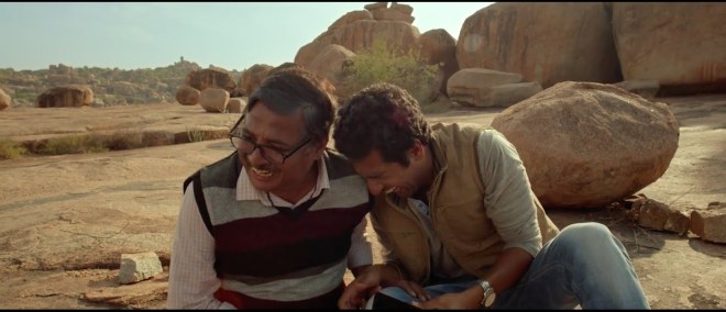
maxresdefault (3)While Maggi and Paper Boat struck a chord with the younger age group of audience; Google tried to appeal to the older age group by creating a 6 – minuter titled “ The Hero – A Bollywood Story”. It dealt with the intrinsic role of Bollywood in creating aspirations and also dousing them. You can see it for yourself here: https://www.youtube.com/watch?v=eYqEpuifLI8&t=255s.

In my opinion,  the underlying theme in the ad film was that it tried to highlight the aspect of how the older generation missed out on achieving their dreams as they did not have access to technology”

So many times, we try to explain technology to our parents and that results in some hilarious anecdotes. However, instead of resorting to humor of the situation, the ad tries to reveal the warmth of this encounter.

By highlighting the father-son dynamic and changing role of the son towards his father; it worked on two levels:

  • For the youth; it fostered a positive dynamic by showing how the son wanted to help his father cope with reality instead of rebelling without a cause.

  • For the older generations; it brought back memories of dreaminess of their youth, something that they lost along the way.


McDonald’s

Dollar Impact Glance

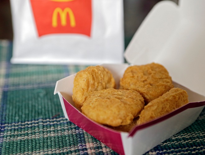
Although not an ad aired in India; McDonald’s touched upon the emotion of ‘Simpler Childhood Times’ when it showcased the goodness of its Chicken McNuggets being made from whole chicken meat and nothing else! Although the concept was slightly beyond those that ordinarily employ nostalgia; McDonald’s did this by juxtaposing the father’s simple childhood with the more complicated childhood of his daughter.
For a fast food brand to bank on goodness and nutrition was in fact a big gamble. However, McDonald’s accomplished this by portraying eating at McDonald’s as a family activity rather than a hasty meal. Through the use of ‘Time after Time’ as the soundtrack, it struck a chord among the viewers by replacing the memories of a technologically driven childhood of today’s kids with memories of simpler times. The final message of the advert is that Chicken McNuggets have still retained their simple, pure, and uncomplicated taste. This prompted the viewers to associate childhood and McDonald’s as a ritual, thus combining the best of both worlds.  

Freia Chocolates

freia-kvikk-lunsj-chocolate-camping-600-60554

A chocolate brand from Norway, Freia Chocolates, employs the tagline, “Et lite stykke Norge” which loosely translates to ‘A little piece of Norway’. The marketing communication of this brand too, is centered around nostalgia. One such ad, stands out for its simplicity and clear message.

The ad opens with the protagonist who is living the high life in New York as a fashion stylist and the feeling of alienation to which the piece of Freia Chocolates acts as a catalyst. He impulsively hops on a plane to see his father immediately after. The ad closes with him opening a styling salon in what is presumably his hometown.


I personally feel that it successfully juxtaposed the alienation, that is a byproduct of the American lifestyle, to warmth and familiarity that is usually associated with European countries.

The ad works on many levels, but mainly it fosters the feeling of ‘belonging’ for those who stay far from their motherland like expats, Non-resident immigrants or even families who have moved away from each other.

Why Nostalgia Works:

The above examples illustrate how different aspects of nostalgia have all been used in one way or the other to get the audience to reminisce about a simpler and easier time.

“Nostalgia works best when the audience has a bank of positive memories that they associate with. Thus, it may work better when your target audience is of the age group 30 and above.”

The association of a product with positive recall is more likely to trigger a purchase or be on the top of mind recall when the audience is at the point of purchase.

The Bottom Line:

“No memory arrives alone and no memory is limited to one sensory perception alone. Hence, our memories are often complete sensory experiences that include the sense of touch, smell, sight, sound, and sometimes even taste.”

In a film that deals exclusively with the myriad and wonderful ways of storytelling, Ang Lee’s ‘Life of Pi’; the concept of nostalgia is an underlying factor in almost every frame. Be it the protagonist thinking of his childhood, explaining to the journalist about his hometown, recounting a lost love – memories and longing is evident. The final scene in the film concludes it the best. Pi, the protagonist asks the reporter “So tell me, since it makes no factual difference to you and you can’t prove the question either way, which story do you prefer? Which is the better story, the story with animals or the story without animals?” the reporter replies “The one with the tiger; that’s a better story” to which Pi Patel peacefully responds, “ Thank you, and so it goes with God”. And so it will… We may never understand the pull of memories and its repercussions, but what remains is their irreplaceable role in our lives towards creating happiness, if only momentary.

id-03-e1509085569505.jpg


Amruta Ghate is a Communications Post Graduate with a keen interest in writing and poetry. As a Digital Content Writer at Setu Advertising, she brings to the table, creative content that succeeds in conditioning and engaging the readers, that translates into content amplification.

The art of naming it right!

They say what’s in a name. Well, the answer lies in the fact that so many brand names have become verbs! We Xerox but we don’t photocopy. We Google but we don’t Bing. How has Velcro ‘fastened’ and ‘looped’ itself so easily as a brand into the minds of consumers across ages? Well, the story is interesting. And that’s why we say, a lot’s in a name. When many brands compete in the consumer’s mind space, his mind becomes a battleground of names. Whichever he remembers the most, wins.download

When I was a kid, I used to love dogs. I remember calling all of them Fluffy. Then, when we moved into a new house, our neighbor had a huge dog with very large, brooding eyes.  He used to bark continuously, and whenever I would go near him, he would growl at me. Soon, the definition of a ‘dog’ changed from fluffy to fear. Well, it’s quite true, and science tells us that as humans, we cultivate positive or negative connotations to words, based on how we feel. And this plays a huge role in how we perceive words and things around us.  We keep evolving and so does the way in which we relate with certain words.

As our vocabulary grows, our mind is no longer a blank slate it used to be when we were younger.  Research says, an average English-speaking adult’s vocabulary is around 30,000 words, or even more! Slowly, the connotations we associate with them also become pretty solid as we grow older. That’s why it is a challenge for brands to get into a consumer’s mind-space, and moreover, to be remembered. Then how or why do certain brands become successful? Let’s explore!

“The dictionary of our mind is filled with words that have negative or positive emotions tied to them. The challenge for a brand name is to create its own mind-space. Stay there. And evoke positive emotions.”

Names strike an emotional chord

Imagine a brand to be a nice, exotic curry.  A lot goes into its making. After all the water evaporates, the thick, delicious essence that’s left behind is what leaves an unforgettable after-taste. It is this essence that makes you want to remember the brand. It evokes a certain positive feeling within you. The mere mention of it, and that is – the name.  With the name, a brand becomes a person, a living, breathing entity that evokes either positive or negative emotions in us.  There is a story behind everything we savour or detest. A good illustration would be the brand name Victoria’s Secret.  The name instantly strikes a mysterious, sophisticated note, making it much more likely to remember. Thus, making it the most spoken about brand after its first store was launched in 2012 in America. The sales went up to $6.12 billion, and today it is the largest American retailer of women’s lingerie.

“With the name, a brand becomes a person, a living, breathing entity that evokes either positive or negative emotions in us.”
Often, it’s just love-at-first-sound!

A brand name is a capsule that is filled with emotional and intellectual content. It carries the unique meaning of your product and its story with itself wherever it is used. Let’s look at the name Google. Today it is hard to imagine a life without this name. If we are stuck with anything, all we say is ‘Google it’. Not only is it a brand name that became a verb for searching online, it also became synonymous to a solution provider! In an era when search engines had already become popular (Yahoo!), Google made a mark with its odd, but easily pronounceable name. A twist on the word googol, Google made something techie sound really ‘familiar’ and ‘lively’.

“A name carries with itself the personality of its brand, what sounds nice registers better, and that is why the consumer falls in love with it at first sound, remembering it over a competitor’s product!”


The global linguistics challenge

With a unique name that is easy to spell and fun to say, comes the next challenge. And that’s being sure it doesn’t have any negative connotations in another language. If the brand is being launched on a global platform, consulting native speakers becomes important. Ensuring the brand name isn’t associated with any slang and other negative cultural perceptions, prevents embarrassing situations later! In 1971, when the Ford Pinto was launched, the translation of the word ‘Pinto’ in other languages was ignored. It turned out ‘Pinto’ was a slang term in Portuguese for male genitals. With the tagline “The little carefree car” Ford tried to cover-up for the name-blunder, but due to some technical vehicle defects, the car stayed synonymous to its unfortunate translation!

510mbvuHVtL._SY450_

Two familiar words, one original name!

The birth of an original brand name is often achieved by putting two simple words together. And it has worked wonders for brands!  What better example, than Post-it. Today, the challenge is not just having a space in the consumer’s mind, or having an excellent recall value. It goes much beyond that. Many brand names are already trademarked and have registered domains. Making compound words is thus, a great idea to overcome this challenge. Another excellent example is PhotoShop, as it communicates the purpose of the product very effectively. Two familiar words put together to create a meaningful, harmonious effect.

“Often we see so much creativity and inspiration with quirky brand names all around us. All we need is the creative eye for it. The inspiration to create something different and original by giving simple words a twist”


Just verb it!

“When people use your brand name as a verb, it’s remarkable.”

Meg Whitman,
CEO, Hewlett Packard Enterprise

We don’t YouTube, but we do Skype. Names that suggest application, are easily used as verbs. Over a period of time, Skype has achieved this glory. It has transformed into a verb today, but the name had the ability to be used as a verb. It was so synonymous to the activity, that it became the activity itself! This is called ‘verbifying’, but it can be dangerous too, as the brand becomes popular but suffers from ‘genericide,’ meaning losing the legal power of a trademark! Well, it certainly does become a part of people’s daily lives, which is remarkable.

Putting the pieces together

Serious or quirky, distinctive or funny, brand names that work the most are imaginative and evoke positive emotions in the consumer’s mind. Today is the era of coining words; take for instance Gatorade, Doritos, Tostitos, and many more.  So do names always need to mean something? Well, not necessarily as the name will soon become synonymous to your business. It may not exist in the dictionary, but it can make an unforgettable mark in the consumer’s-dictionary.


What’s important is that the naming approach must be in tune with the graphical representation of the name. That way we achieve two things – the emotional perspective of a brand name is in perfect rhythm with its visual identity, and it looks good in writing! Recently I visited a unique place in Kothrud, Pune, called Yolkshire. Apart from the interesting name, this outlet serves all types of egg dishes. So apt! The name and visual interpretation are in perfect sync with the quirky ideology of the brand’s offering.

“Getting as imaginative as you can be with the name is key. The name may not exist in the dictionary, but it can make an unforgettable mark in the consumer’s dictionary.”


After the brand has acquired its own personality, it will truly appeal to the masses. And maybe then, we can say that the brand has won the battle for space in the consumer’s mind, because now he/she is interacting with a person and not a company, just like the King of Advertising said it!

“The public is more interested in personalities than in corporations”
– David Ogilvy


ID-01Devangini Karkhanis, an MBA in advertising, embarked on a journey to become a copywriter 6 years ago.  With a vision to put her passion for words and mind full of ideas to good use, she believes her work has taught her a lot over the years. Working in the creative field has been an enjoyable and enriching experience, and it has given her the opportunity to go beyond writing, and become a good communicator, strategist, and an artist too!

Devangini is an English Copywriter at Setu Advertising.

THE STORY OF THE HEADLINE

“On an average, five times as many people read the headline, as read the body copy. When you have written your headline, you have spent eighty cents out of your dollar.”

 -David Ogilvy

Yes, we just took the most cliched route to start a conversation about the most important aspect of any advertising communication –  the headline. But then, when the master has himself said something that has been followed religiously (we would all like to think so) by every single copywriter in the industry – across the world – why not just stick to it, at least to set the context.

Okay, so we’re going to talk about headlines (no surprises there). But because enough has already been written about how to write a ‘good one’ by people who have shaped advertising, we’ll do something different here. We’ll take a look at the journey of a headline, from then till now. Why? Well, it’s simple. While the motive of a headline or the task assigned to it has remained the same (it should sell), everything around it has changed drastically.

“The changing scenarios have had an extensive impact on headlines, and the art (more of a process) of writing them.”

No, we’re not yet talking about the evolving cultures. That’s just too vast and complex. For now, we’re sticking to a relatively smaller area of a transformed advertising ecosystem. From evolving media to the available space and from baffling (either too big or too small) budgets to declining attention spans, everything has undergone a colossal change in the past few decades. So, while every word from David Ogilvy’s statement holds true even today, the changing scenarios have had an extensive impact on headlines, and the art (more of a process) of writing them. Let us see and understand how headlines have evolved over the years.

THE GOOD OLD DAYS

Rolls Royce

This ad by David Ogilvy for Rolls Royce in 1957 is legendary. With the amount of body copy in it, one might confuse it with an advertorial. But this was the trend back then – ads that were copy-rich. Now ignore the body copy (It’s hard to do so, but still). Just look at the headline. It’s a really long headline, but manages to get the reader hooked to the ad. And this is just one of the ads that Rolls Royce did back then, as a part of the campaign, where most of the captions were really long. It’s interesting to understand the reasons why such long captions worked back then.

“The headline used to be entirely different from the campaign line. In fact, many headlines were used to reinforce the campaign line.”

  1. Lesser advertising – In the 50s and 60s, there were fewer brands across different sectors in the market, which meant lesser clutter and ads, for the buyer/reader to look at.
  2. Print medium as the first point of contact – While television had started entering homes, newspapers led the way in communication. The medium itself supported this form of writing because of the available space.
  3. Lesser visuals – As compared to today’s day and age, access to a ready visual library was weak, because of lack of technology, which meant more scope and space for writing.

The biggest takeaway from this is the fact that the headline is entirely different from the campaign line.

While this was the scenario in the US and the West, Indian advertising was still in its nascent stages. As a result, Indian print ads rarely witnessed this ‘phase’ of headlines.

THE 80s AND 90s SHOW

By now, television had well and truly taken over print as the primary medium of communication (The Bold and the Beautiful, Nukkad and Circus were a part of people’s conversations). At the same time, brands from certain segments continued to reach out to the audience through print ads. All this had an impact on the nature and style of headlines. What stood out was:

  1. Crisp headlines – The advent of “less is more” philosophy impacted both – the headlines and their length.
  2. Bigger images – From a copy-centric ad layout, the visuals and words started sharing equal space. The visuals became more dominating. A copy-driven ad with a classic headline became a special occasion feature.
  3. The punchline had arrived – It was observed that the campaign line inadvertently became the headline for the ad. Gone were the days of different headlines leading to one brand line. The punchline started calling the shots.
  4. Headlines became emotional – Instead of focusing on direct product benefits, a more emotional packaging emerged through the headlines.

Inspired by Neil French’s work in Singapore, like this ad for ibid.com, even Indian advertisers took a more daring approach to writing headlines. But, this was restricted to a niche, urban audience.

The dominant advertising, and hence the headlines, became more emotional and crisp. More importantly, the focus had already shifted to the television sets, where headlines were heard, not read.

Bata

THE 21ST CENTURY

“In the age of 140 characters, the headlines for print advertising have been through a lot (both literally and figuratively).”

Over the past decade, the world has been taken over by the power of internet that has connected everyone, everywhere. This has led to more and more brands reaching out to more and more people. Print continues to lose its importance – at least in an advertising sense – as brands find out newer ways to connect with the audience (It is used more as a tool to complete the promise of a 360-degree media plan). While television is dominant, the internet and its different tools now offer more profitable advertising platforms. In the age of 140 characters, the headlines for print advertising have been through a lot (both literally and figuratively).

  1. Lesser space – As many brands jostle for space across media, the available space has reduced significantly; and the length of the headline.
  2. An over-burdened audience – As social media takes over the lives of the people, they are left over-burdened by the content being circulated around. At times, this has even led to print ads being devoid of a headline.
  3. Reading, a dying habit – As visuals capture the mind space and films become easily executable and accessible, reading as a habit, is on a decline.
  4. The hashtag phenomenon – Conversations now subscribe to brevity with hashtags and emoticons taking over words and sentences.

“The journey of a headline subtly captures the evolving cultures that we’ve all been part of, over the years.”


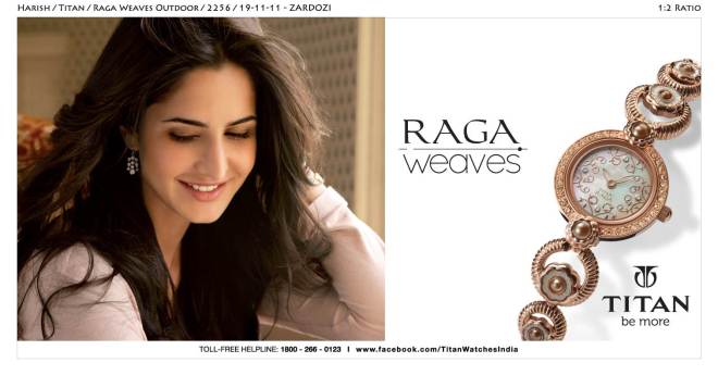
Titanbig-bazaar_newspaper_ad

If you look at it, this journey of a headline subtly captures the evolving cultures that we’ve all been part of, over the years. It shows how our tastes have changed, habits have evolved, and even the preferences have undergone a sea-change.

But the one thing that remains constant is that the headline is still 80 cents of a dollar. A good one does a lot of good for the brand. And a great one; well we all know what it has done to us, so many times.

Amey Pendse
Amey Pendse is an engineer by qualification and a copywriter – not a writer – by profession. He likes to keep it simple – in ideas, and in writing. He essentially thinks and writes in Hindi and English and has a keen interest in writing radio ads and TVCs. With 6 years of experience, Amey is a Senior Copywriter at Setu.